Travelers Network Case Study
Problem Statement
Customers do not know the travel time and any traffic issues prior to getting in their car and embarking on their daily trips
Challenge:
Create an app that gives users personalized trip reports with actual video reports as well as turn by turn navigation and expected delays and alternate routes.

User flows + journey
For this phase I completed a competitive analysis and used the findings to help determine user needs and potential features.
I created user personas from that point and sketched out journey maps for each type of traveler (ie. commuters, tourists, errand runners) and trip types (ie. short/long and know vs unknown destinations). With established user goals, informed by research, to ensure a successful completed journey - I then developed screens on how users would best interact with the interface.

Planning and Wireframing
In addition to our USP, live video broadcast traffic report coverage and up to the minute weather reports - my competitive analysis indicated that the application also need to have trips, road conditions, traffic cameras, UGC, saved locations and waypoints on a journey just to keep up with the existing marketplace - Google Maps, Waze, Inrix, Apple maps and Beat the Traffic.

Annotated Wireframes
Using annotated wires i was able to incorporate a variety of content for a diverse user base. The wires enabled me to show the various size layouts and how the breakpoints and form factors would impact the layout, designs and user interactions.
As the blueprints for the solutions, the wireframes allowed me to walk through the team through an ideal user journey. The annotations ensured all stakeholders were aware of the details and expectations from the user perspective.

Usability Testing
The paper prototyping was done early on in the development cycle to gain a better understanding of what users noticed on 'screen' and what they would care about. I tested about 7/8 users to get some user behaviour patterns indicating changes we needed to make.
Later in the dev cycle i wrote a task based user test that gave us the consumer feedback we needed to determine any pain points, trouble spots or concerns when a user was using a live 'beta' version of the product. It alerted us to delays in real time info, and offered credibility to directions, trip estimates and alternate route solutions we calculated on the fly.

My Trips
The core functionality of our app was providing users the opportunity to preview what their trip ahead looked like, using various data sources. We had a traffic control centre, on-air talent broadcasting traffic reports of the 16 regions we covered across the GTA (in pilot mode).
We then would dynamically stitch together routes, directions and videos that took users through their journey to their destination, and even provided them alternate routes to avoid congestion.
These screens were designed to clearly communicate the status of their trips, before they left. The directions and turn by turn navigation was to be released in subsequent versions of our app. The my trips screen showed the users the travel time for their saved trip, delay estimate, video report, colour coding and iconography to give them an idea of how their journey was looking.
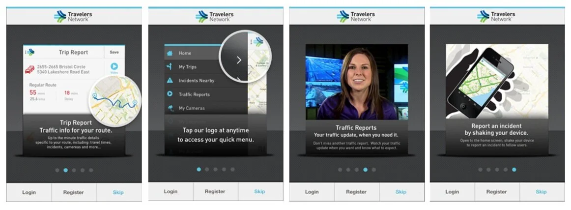
Demo and Walkthrough
These screens were created to help onboard users to the app and service by showing some of the interface elements and features.

Marketing and Promotion
Demo - I wrote a script and helped direct an on-air demo of our product and the service. It was done by our talented on-air presenters to showcase the features of Travelers Network and how it could make their lives easier.

Social Media and Visual Design
Infographic I created to highlight the key market trends and need for a service like "Travelers Network"